Congruence
“Paper Architecture” assignment: Publication design, inspired by Australian Architectural Award winner “Levos House,” by Clinton Murray Arcitects.
- Supervised by Alex Margetic
- Supervised by Alex Margetic
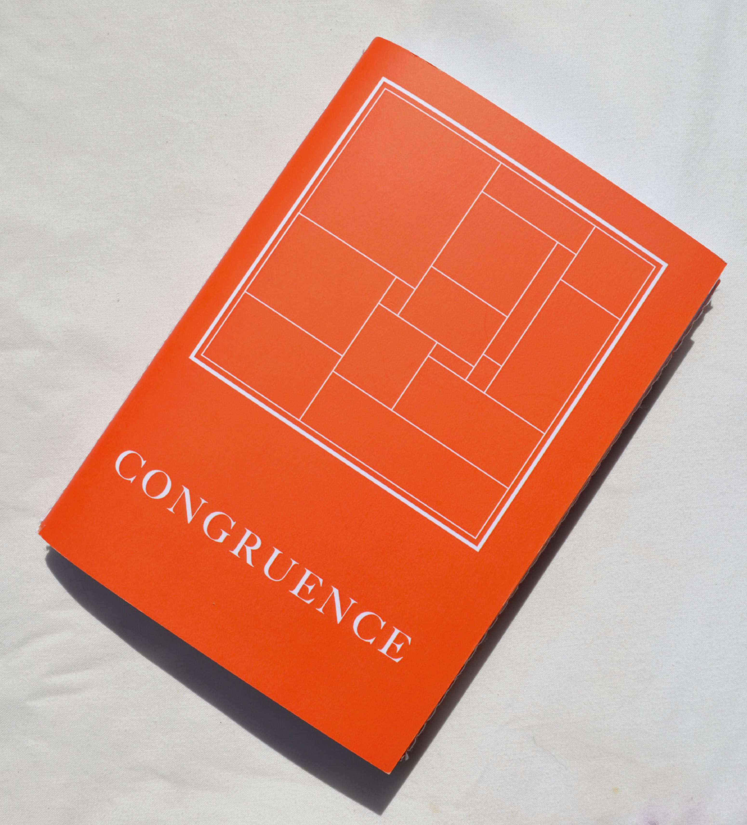
Congruence explores the synergistic relationship between architecture and graphic design, paying homage to “Levo’s House,” by Cinton Murray Architects in the Australian Architectural awards. Congruence means to be in agreement or harmony, alluding to the idea of compatibility, which epitomises the industrial and natural relationship that coincides with the materials used to construct this building. In geometry, congruence is a term used to describe two shapes that have the same size and shape and ultimately are a complete reflection of each other. This plays on the geometrical concept explored throughout the architectural design.
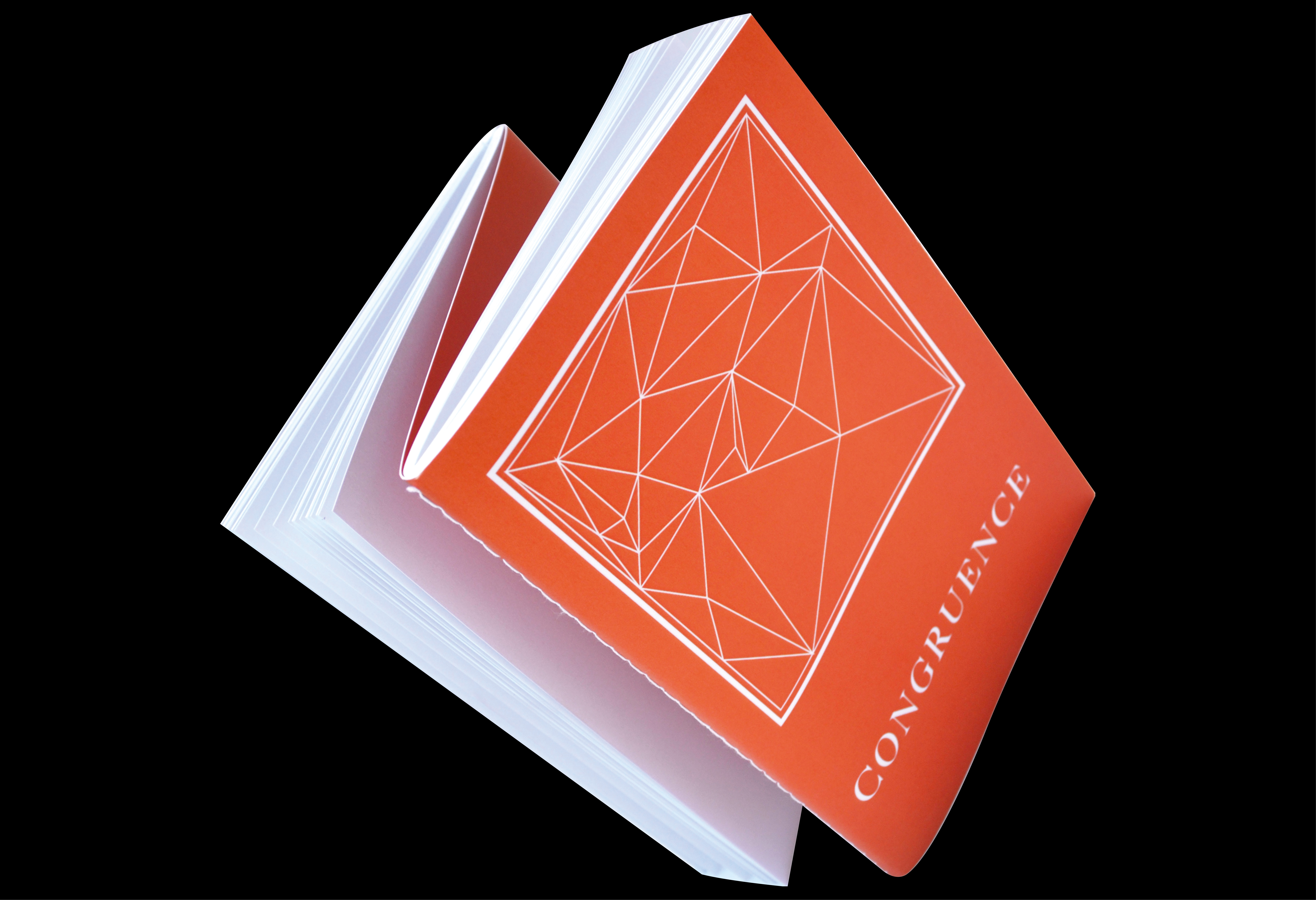
I chose the dos a dos binding method for my publication, which means “back to back” in French. The structure of this binding method incorporates two separate books which are bound together with a shared spine. Ultimately, the two “back to back” books each explore the two definitions of the term congruence and how they are both integral components in forming the makeup of this architectural building.
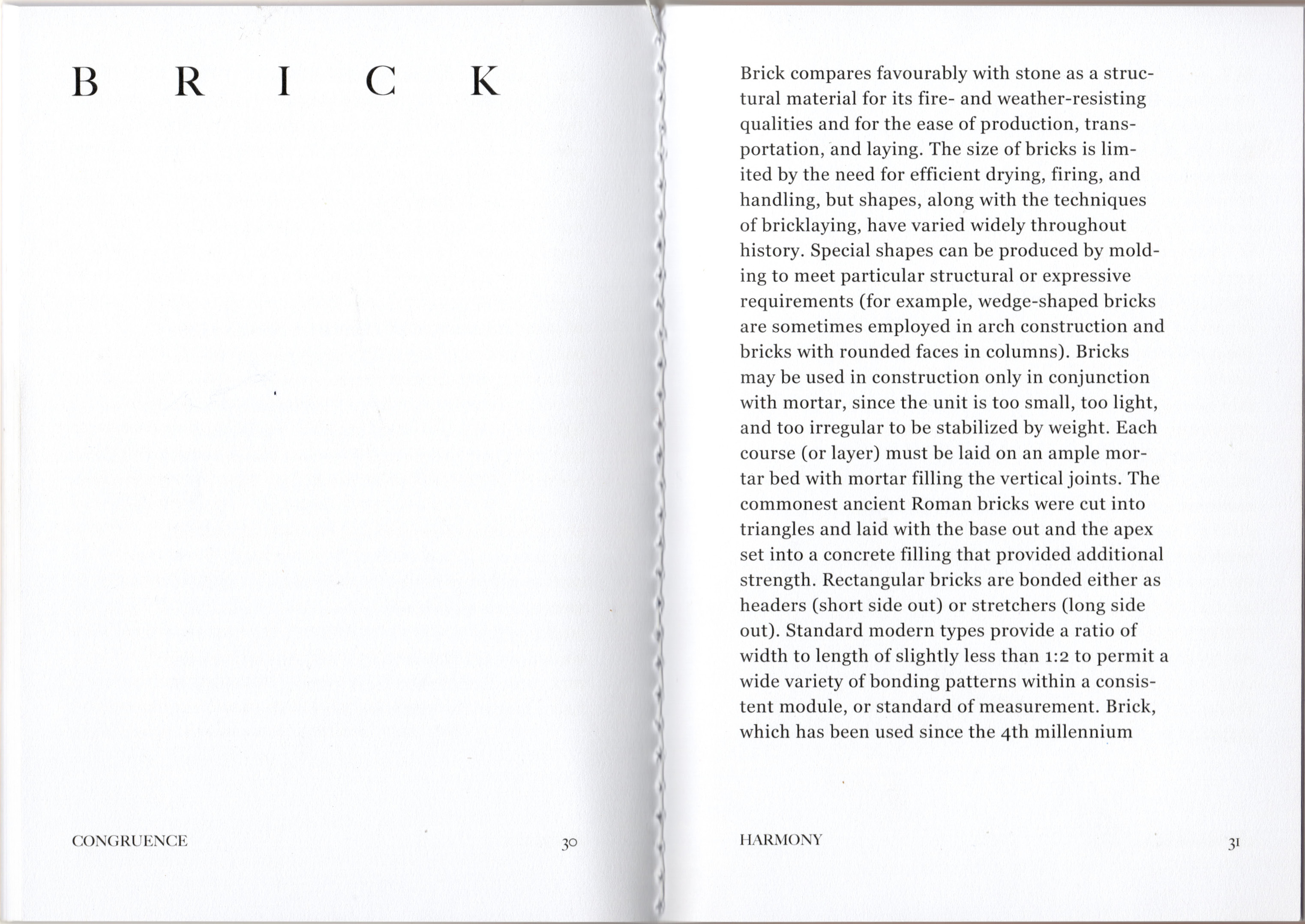
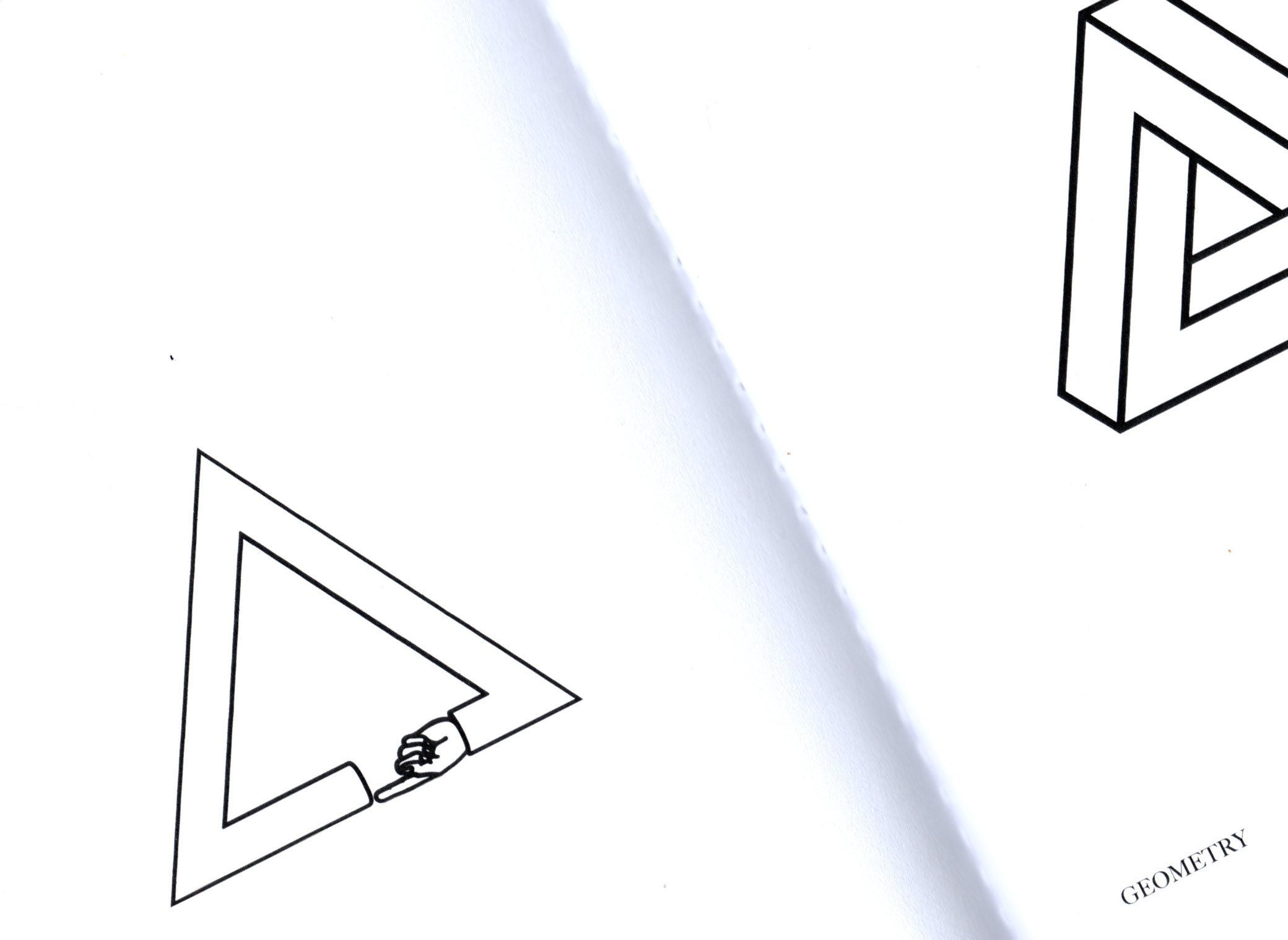
Book 1 ponders natural and industrial materials utilised in modern architecture, whilst book two visually explores 50 design variations of a triangle that are all the same size.
︎︎︎ Size: B5
︎︎︎ Paper stock: Sovereign Offset 135 GSM
︎︎︎ Binding: Stitched - Dos a Dos
I chose the dos a dos binding method for my publication, which means “back to back” in French. The structure of this binding method incorporates two separate books which are bound together with a shared spine. Ultimately, the two “back to back” books each explore the two definitions of the term congruence and how they are both integral components in forming the makeup of this architectural building.
Book 1 ponders natural and industrial materials utilised in modern architecture, whilst book two visually explores 50 design variations of a triangle that are all the same size.
︎︎︎ Size: B5
︎︎︎ Paper stock: Sovereign Offset 135 GSM
︎︎︎ Binding: Stitched - Dos a Dos