Kiss + Tell Music Collective
Coordinating brand idenity, promotional material, marketing strategies and all visual elements across print and digtal platforms.
Role: Founder and Creative Director
Role: Founder and Creative Director
Making reference to Melbournes illegal rave scene, the name “Kiss and Tell” plays on the play-ground like gossip temperament of an up and coming rave. Music groups would disclose limited event information to a select few, then on the day of the event, the location would be released hours before comencement, leading to a chain reaction of gossip through group chats and word of mouth. Ultimately, this expansive network attracts rave goers from all regions of the area to dance in solidarity and be a part of a liberating community.
The logo design can most recognisably be identified as a symbol of vandalism, scribbled on the inside of a toilet cubical or scratched into the bark of a schoolground tree. A true icon of romantised gossip, two letters joined by an addition symbol encapsulated by a love heart, became the formula for intimacy between two suspected lovers. Hence, the logo not only embodies this nostalgic school yard imagery but incorporates the company name into the initials of the logo, Kiss + Tell.
︎︎︎ Size: A5
︎︎︎ Paper stock: Silk HD Matte 150 GSM Coated
︎︎︎ Binding: Spiral Coil Binding (Red)


gsa


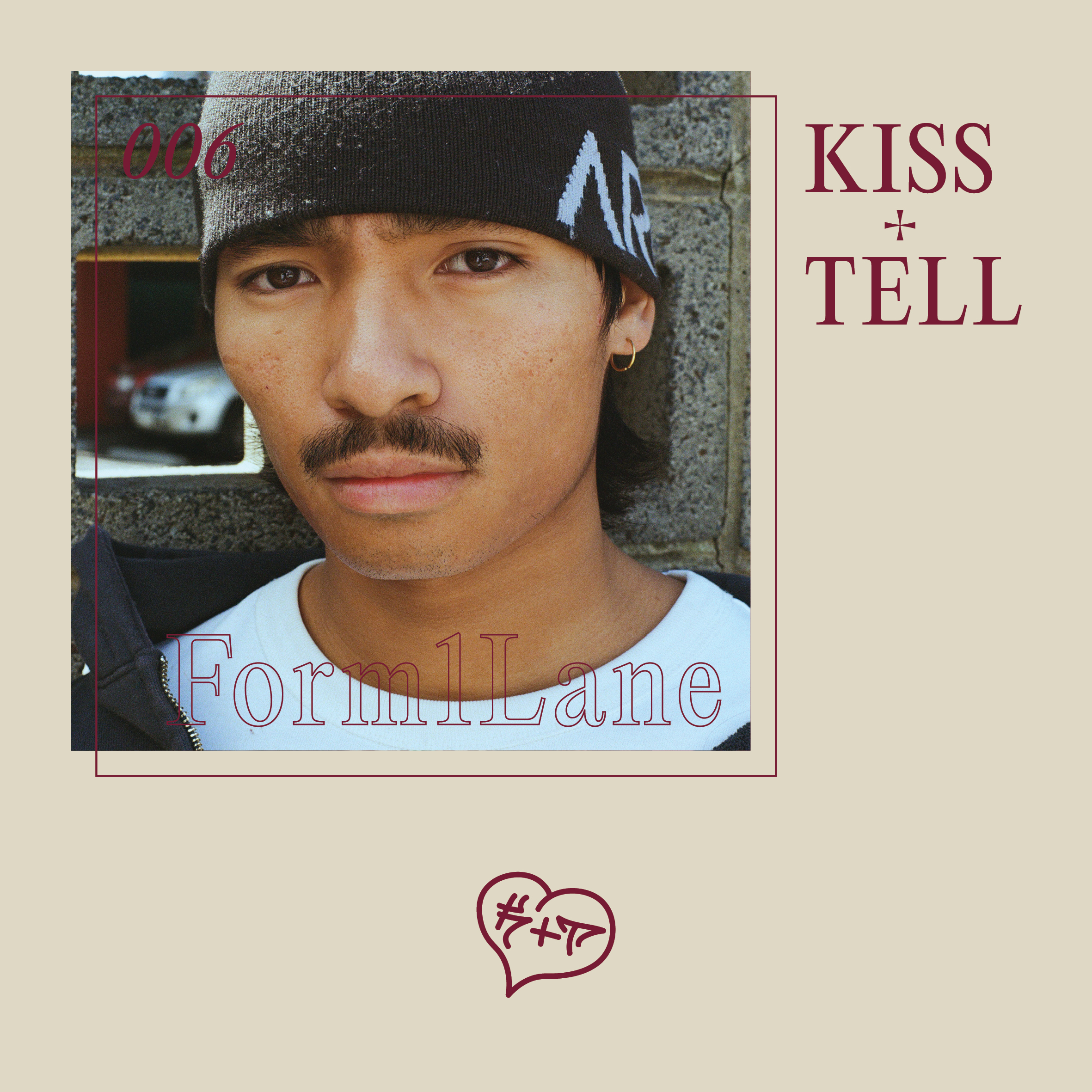
Kiss + Tell Invites: